If you’ve been using the site for a while, you probably noticed big visual changes a month and a half ago! As we worked on making RunThere easier and more fun to use, we decided that it was time for a new logo. Our previous logo was a bit large and we couldn’t quite get it to fit in our new site, so it had to go. We also felt that the logo itself was too complicated and didn’t look good at small sizes (two criteria for successful logos, see: http://www.davidairey.com/what-makes-a-good-logo/).
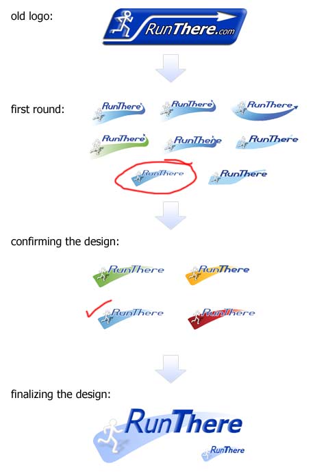
So let’s walk through our logo evolution (which is thankfully short, we’ve still got a website to make!). See the image below for the visual progression. First, we discussed the elements that we liked and what needed to go. We want our logo to convey two things:
- Running, and
- Creating a trail/path/route
We felt that the running person took care of #1 and the arrow took care of #2…. so how to combine these elements?
The first round of designs worked with different arrows, but we couldn’t quite come up with a simple arrow that pleased everyone. In the end, we chose the fading triangle path for two reasons: simplicity and readability at small sizes. Also, the design has the added bonus of allowing different background colors (see ‘confirming the design’) and different silhouete people/bikes/etc. To finalize the logo, we brought back the original font and re-made the running person.

So what do you think of the new logo and the new design? Click here to send your feedback!
