We’re finally releasing the first “social” part of our “social networking for runners”. This first step will let users send messages to each other, share routes easily, and invite new users to the site. This release prepares us for some features that are in the works. Think virtual running challenges!
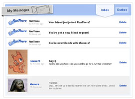
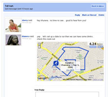
Here’s a message inbox and a message thread with an attached route:
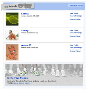
Here’s a friend list:
Exercise Log replaces running log
You can now log bike rides as well as runs. Having bike rides in a “running log” didn’t make sense, so we renamed this feature.


Redesigned route icons!


New dog-friendly tag for routes
 Love to walk or jog with your four-legged friend? Now you can mark your routes as dog-friendly. Just look for the dog-friendly icon when you save your route.
Find out more about the creators of RunThere
We’ve whipped up an about us page so you can meet the people who have been creating and improving RunThere since 2005!
That’s it for this release. If you encounter any problems or want to contact us. Visit our feedback page.
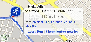
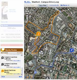 After saying “coming soon” for way too long, route search has arrived! We’ve also taken this opportunity to update all the icons that show up on the map. Here they are…